Global News Trends
I thought it would be interesting to globally map the news. So I developed a Java app to aggregate 16 news feeds for different regions in the world, and devised an algorithm to contextually rank the individual news articles, and then calculate a rank for each region. The news score (NS) was then normalized. A NS of -100 means very bad news, 100 means very good news, -10 means bad, 0 means roughly neutral etc. The more negative the number, the more negative the news.
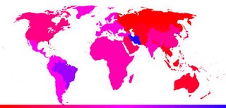
Using these normalized values (in the range [0,1]), I wrote a Java Servlet to generated a colour-coded world map. Hovering over different regions display the region news statistics (AJAX client-side, Java servlet and daemon server-side). The results were quite interesting. The data is generated every 10 minutes.
The scale at the bottom of the image is interpreted as: blue=really good news, red=really bad news, pink = neutral news.
I used the Yahoo! RSS news feed (since Google sadly doesn't supply one yet) and a small database I developed of positive and negative words. Eg: war's negative, peace is positive.
Below is a pretty picture showing the map.

posted by Jordan at 10:20 PM
![]()
![]()

<< Home